23andMe
Dashboard
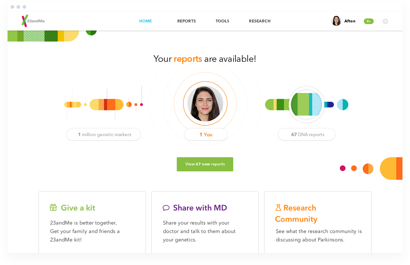
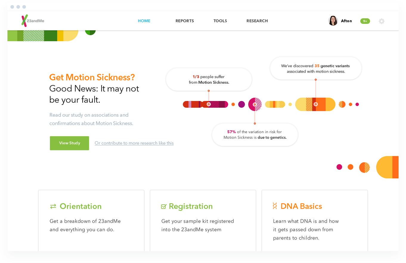
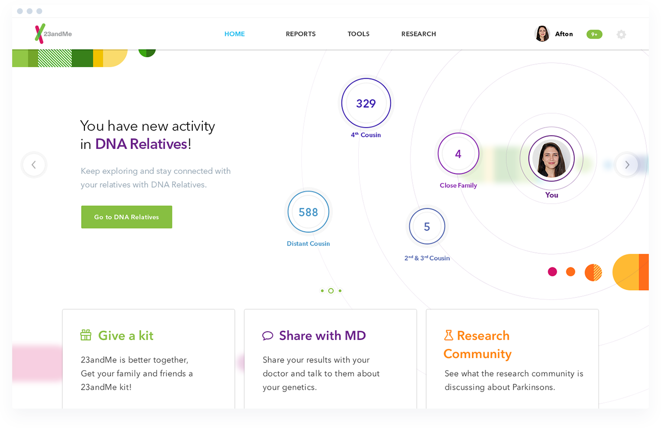
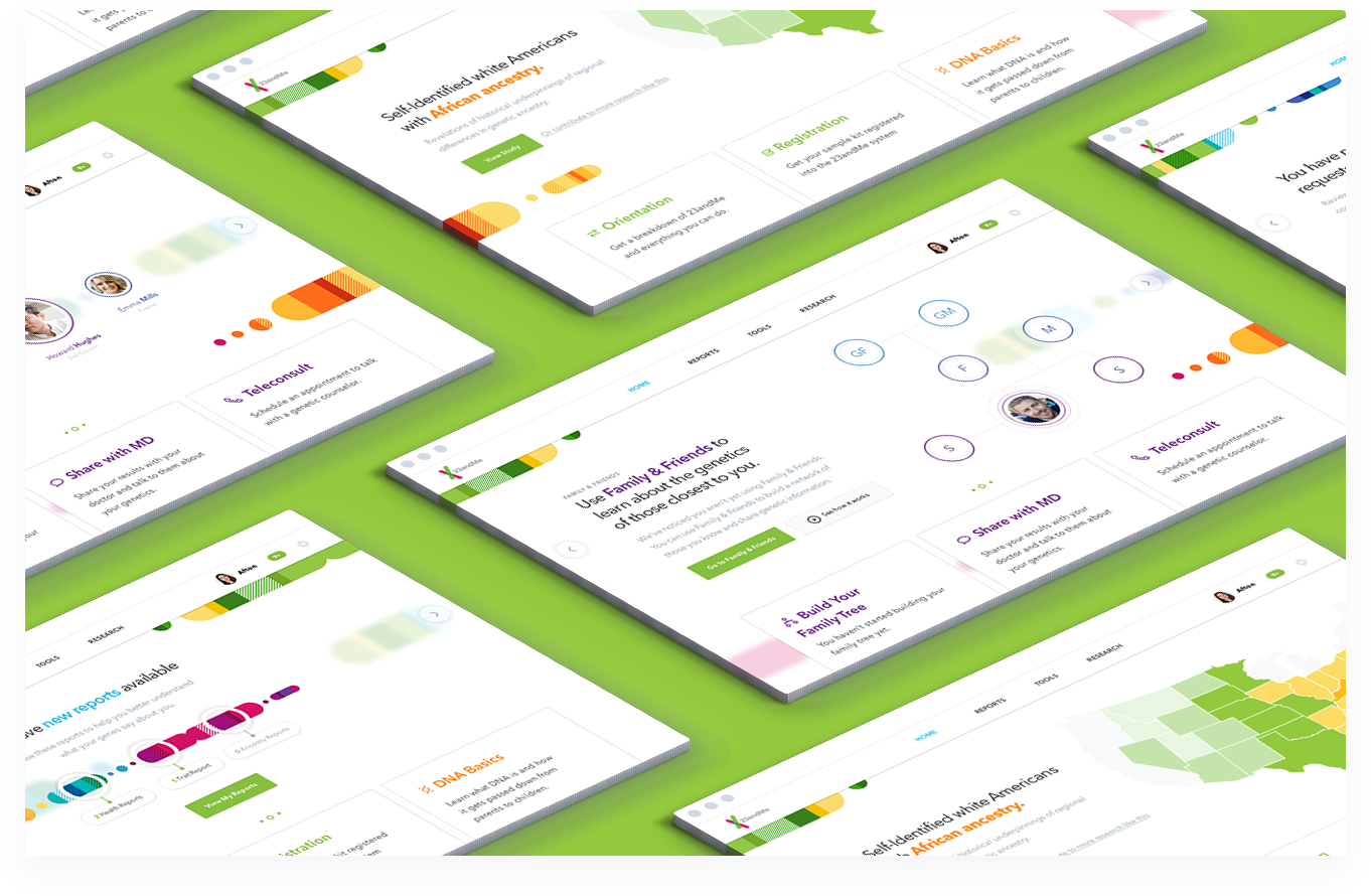
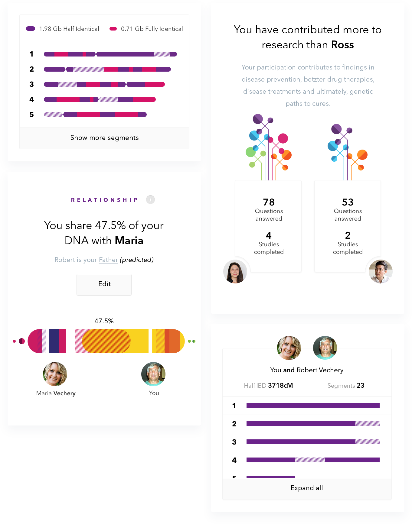
23andMe lets you experience your ancestry in a new way, by giving you a breakdown of your global ancestry by percentages, letting you connect with DNA relatives, giving you access to over 75 different reports on ancestry, traits and health - and more.
In 2015 their online dashboard that held all of this data was in desperate need of a redesign. 23andMe partnered with Fantasy Interactive to rethink their entire UX and visual design. My role on this project was Lead Designer, working closely together with the Fantasy UX team.
CONCEPT
Genetics
For Everyone
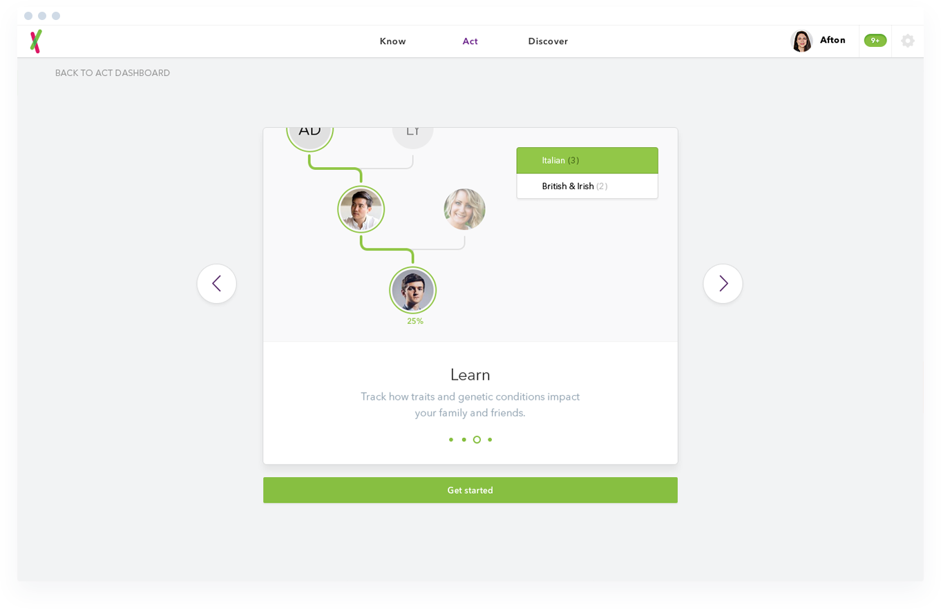
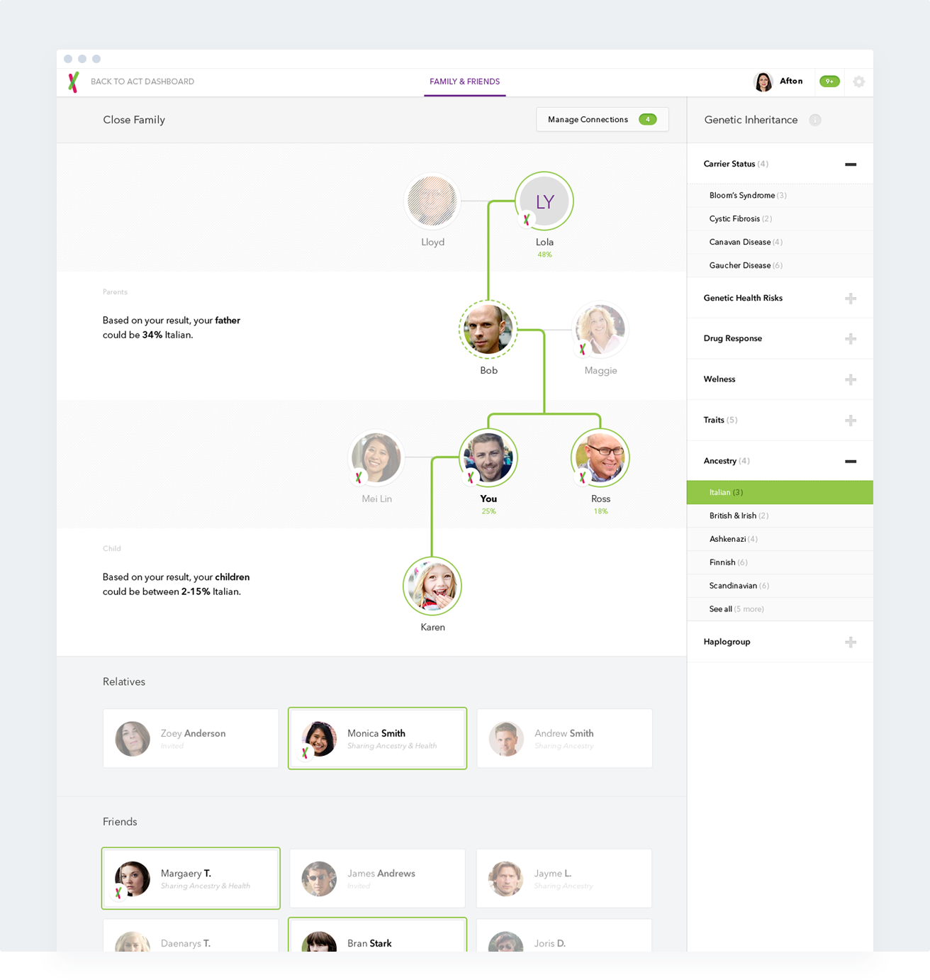
Since 23andMe’s entire focus is about making genetics and ancestry as easy as possible to understand for anyone, there was a huge challenge on both the UX and visual side to translate the enormous amounts of data and reports to clear visualisations and an intuitive user dashboard.
Part of this effort was using their vibrant color branding to build fun and friendly illustrations, graphs and iconography. Big readable typography and good of use of white space, paired with color branding and easily digestable segmented reports ultimately paved the way for our redesign approach.
DESIGN
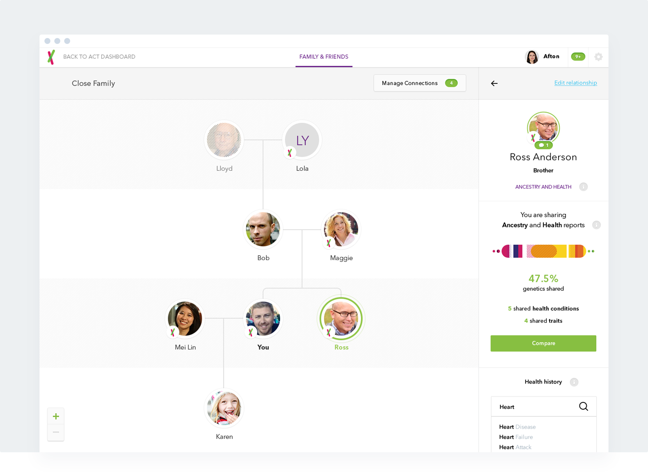
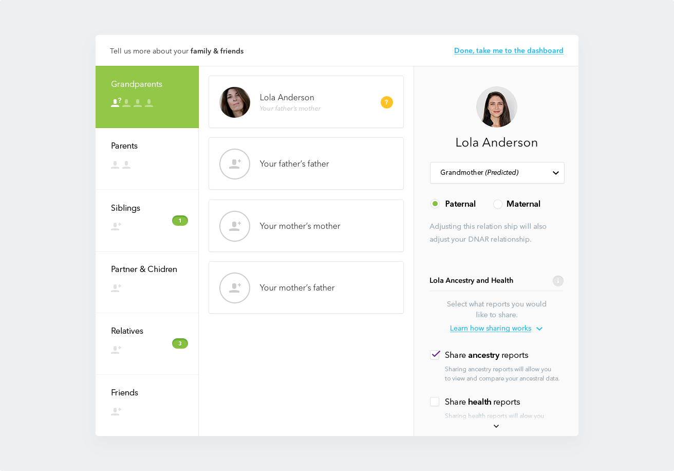
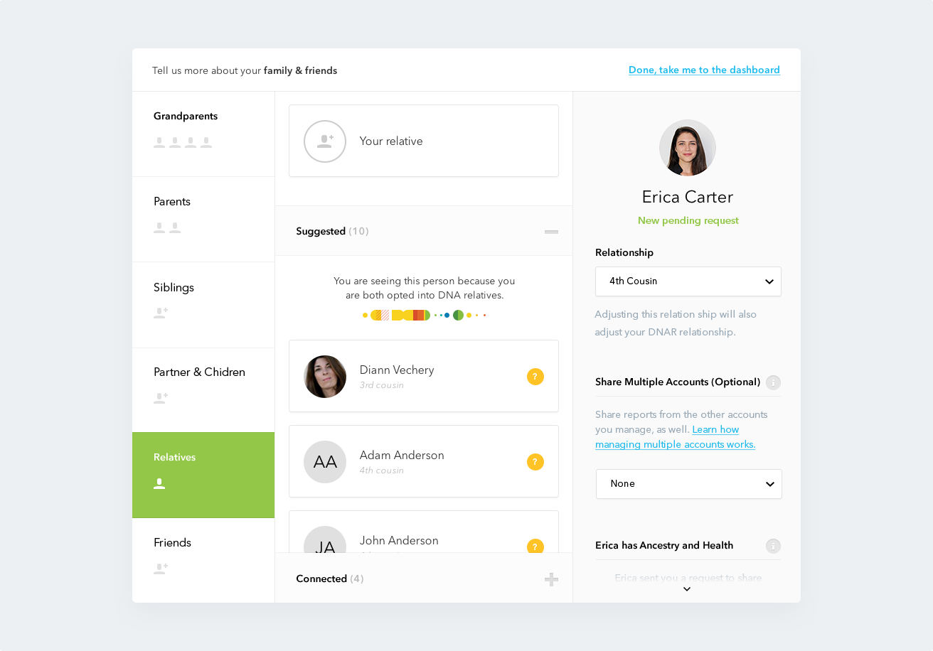
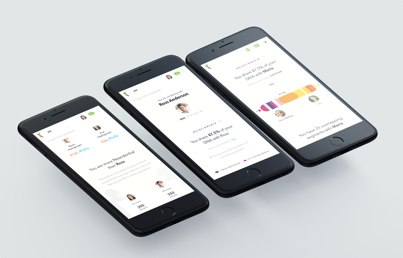
Visualizing Your Ancestry
One of the biggest challenges we faced was coming up with an intuitive yet comprehensive overview for tracing your ancestry, genetric traits, health risks, heritage and several other variables. The total amount of pages designed for this part of the dashboard alone exceeded over 100 pages, including mobile.
Additional Credits
UX Team
Additional Design
Design Intern
Vilia Ingriany
Timmy Chau
Claudio Guglieri
Adrien Thomas
Other Projects
Channel
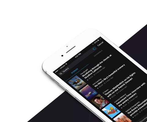
2016 - Swipe LabsLead Design 01
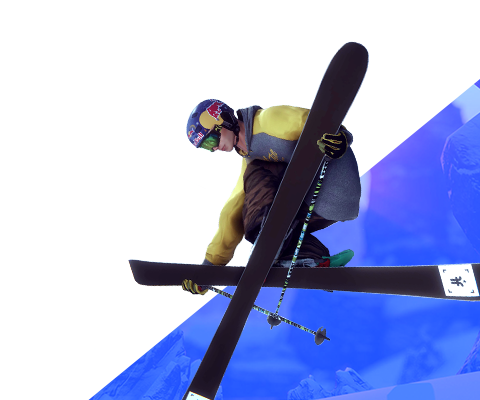
Snow
2015 - FreelanceArt Direction & Visual Design 02
23andMe
2015 - Fantasy InteractiveArt Direction & Visual Design 03
Hp Engage
2015 - Fantasy InteractiveArt Direction & Lead Design 04

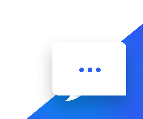
ChitChat
2017 - Swipe LabsLead Design 05
Gruppr
2015 - Side ProjectLead Design & Creative Direction 06
Swipe
2015 - Swipe LabsLead Design 07
NikeYou
2014 - R/GAArt Direction & UX/UI Design 08
Fixd
2014 - Side ProjectArt Direction & Visual Design 09